Hey, {{first_name | reader}}!
Slowing down and realizing the good in things in front of you isn’t always easy. Oddly enough, that made me write this edition of Product Potion. Many stakeholders and people in the product can forget the importance of what a quality UX (user experience) can do for the business.
Three nuggets from today’s potion:
Bad UX is bleeding your revenue dry — and it’s happening in places you’re not even looking.
Strategic UX isn’t about aesthetics — it’s your cheapest, highest-ROI growth lever.
You don’t need a big budget to make a big impact — a few free tools and a mindset shift can change everything.
Newsletter Navigation
First time reading? Sign up here! You won’t regret it. 😉

The Makers Cabinet
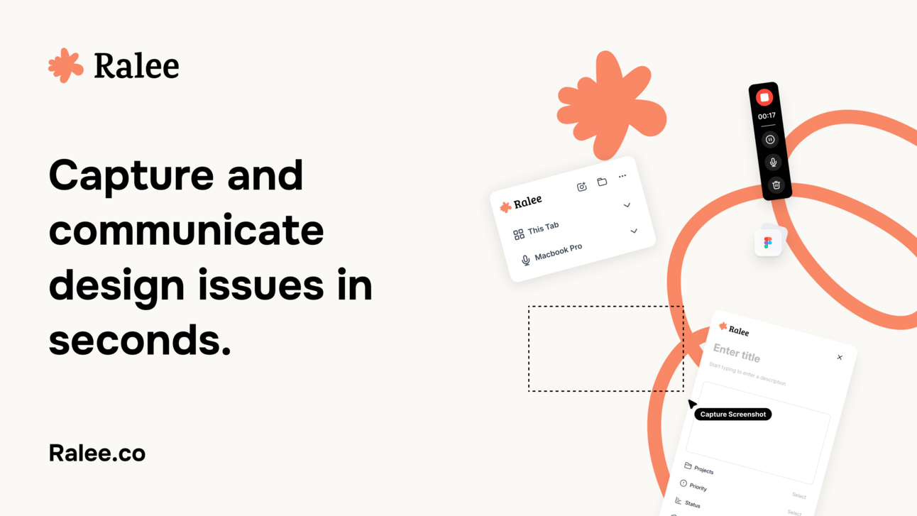
Wyatt Feaster is whipping up the fix for the UI/UX and QA process. Enter Ralee, a solution to capture bugs and design issues in seconds. Communicate the fixes clearly to your developers — all in one place — to designs that are pixel-perfect implementations, fast. Watch the demo video here.
Side note: Nobody has dethroned Ralee yet. Who will take the hill next and wants to share what they’re working on?

Want to be featured? Join the waitlist and reply with your project.

Potion of the Week
The $100K Question No One's Asking
What if your website is leaking $100K in potential revenue each year while you waste time debating font choices?
It's like paying for the all-access VIP pass at Disneyland and then spending the entire day in line for churros. Your customers are walking through a funhouse when they should be sprinting toward their credit cards.
The Real Cost of Half-Assed UX
Have you ever been trapped and desperately needed a bathroom, but none could be found? That uncomfortable, panicky feeling is EXACTLY what your users experience when they land on your confusing website. And just like you'd bolt from that situation, they'll abandon your product faster than a toddler abandons vegetables.
The truth hurts:
88% of users won't return after a bad experience. First impressions aren't just important — they're everything.
Fixing UX issues post-launch costs 6X more than addressing them during design.
5 Ways Strategic UX Prints Money
Conversion Rates on Steroids (400%+ Improvement): Users who can actually find the "Buy Now" button tend to click it more. Shocking, I know. One B2B software company simplified its sign-up flow from 11 fields to 4 and watched conversions quadruple overnight.
Retention That Makes Subscription CFOs Weep (30-50% Higher): Netflix isn't just winning because of content—they're winning because finding and watching shows is ridiculously easy. One SaaS platform reduced churn by 42% by simply redesigning its onboarding flow to highlight the three most valuable features.
Support Tickets That Disappear Into Thin Air (Up to 90% Lower): Every support ticket is a tiny flag signaling UX failure. One e-commerce company revamped its self-service help center and watched support tickets plummet by 83%.
Brand Reputation That Money Can't Buy: Good UX creates trust that converts to referrals. When was the last time you enthusiastically told friends about a product that was difficult to use? Yeah, never.
Development Cycles That Don't Make You Want to Cry: Clean UX decisions upfront mean less backtracking, fewer "emergency fixes," and teams that don't want to quit.
Note: Some numbers are best-case scenarios; not everyone will see the same results.
Case Study: How UX Design Conjured a 125% Checkout Rate Increase
In the following case study, you can see how minor changes can lead to significant impacts.
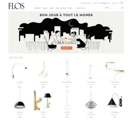
Before: Flos USA (lighting retailer) had a website that felt like shopping in a dark maze; users faced confusing navigation, cryptic product options, and a checkout flow designed by sadists.

Flos USA website before image
The Magic Spell:
Used heatmaps to expose user pain points
Reimagined navigation and product listings
Updated product pages with clear color swatches
Streamlined checkout (removed digital obstacle courses)
After: These targeted improvements sparked a 125% increase in checkout conversion rates and an 18X return on investment.

Flos USA website after image
"But I Don't Have a Budget For That Fancy UX Stuff!"
I hear you. If you’re scrappy (or solo), here are three powerful tools you can start using today:
Google Analytics 4 (GA4): Free, powerful, and tells you exactly where users are rage-quitting your product. Check engagement reports to pinpoint your weak spots.
Session Recording & Heatmaps: Tools like Mouseflow or Hotjar let you watch users struggle in real-time (both heartbreaking and enlightening). Free tiers are more than enough to start.
User Feedback Widgets: Add simple in-app surveys or feedback button. Even a simple Google Form can unlock the why behind the user friction.
The Shift: UX Isn’t a Cost — It’s a Profit Lever
Stop treating UX as "make it pretty" decoration. Start treating it as the engine that drives revenue.
When you bake in UX early, you're not spending — you're investing in not having to re-do your entire product six months from now. That’s not an expense. It’s fire prevention.
Quick Wins You Can Apply Today
Audit your most important flow: Could your grandmother complete it without calling you?
Watch five real users complete a task: Prepare for silent horror as they struggle with what you thought was intuitive.
Kill unnecessary form fields. Each one is a tiny speed bump between you and sweet, sweet conversion.
Let’s Fix What’s Leaking
Stuck? Let’s Fix It Together. I run the Lean Clarity Workshop, a 1:1 session designed to cut through the guesswork and turn messy UX into simple, profitable flows.
We’ll uncover where users drop off
Identify one high-leverage UX opportunity
And map out what to fix first, and why
Book a free discovery call, and if it’s a good fit, I’ll walk you through the workshop live.

Closing Thoughts
Let’s brew something that actually moves the needle.
If you’re building a product and feeling stuck on your next move, or running a business where certain metrics just aren’t budging, let’s talk it through. I want to hear what’s keeping you up at night and help you get clarity fast.
Catch ya next week 👋
— Dana
P.S. Tired of guesswork, and want UX that actually drives results? Hit reply and tell me: Which part of your product do users abandon most? What user flow haunts your dreams?


