Hey, {{first_name | product-preneur}}!
Your website is bleeding money. With only seconds to sell, marketing your product or service may seem impossible.
Conversions equal dollar signs, audience growth, you name it. When a potential customer lands on your website, you want to grab them by the eyeballs and guide them to your intended action.
Keep scrolling to get the full scoop (with an example) on evaluating and improving your website.
What’s bubbling in this week’s potion:
The 50-Millisecond Money Leak: Your website gets judged in 50 milliseconds (faster than you can blink), yet most entrepreneurs obsess over visuals while their above-the-fold section hemorrhages conversions.
The Goldfish Attention Span Myth (And What's Actually Worse): Everyone jokes about goldfish’s attention spans, but your visitors are making stay-or-bounce decisions in under 3 seconds.
The AI Product Flood Reality Check: With AI making it stupidly easy to spin up new products, differentiation is becoming nearly impossible. The businesses that survive this flood will be the ones who master the psychology of those crucial above-the-fold moments.
So let's stop the bleeding and turn that digital disaster into a conversion machine that works.

Link Drops
You need a lot of money to start a business ➜ LinkedIn
Why you should work for free at the start of your entrepreneur journey ➜ YouTube

Potion of the Week
The Most Crucial Moment to Make the Sale
Your website is like that friend who shows up to a party wearing a tuxedo to a backyard BBQ, technically dressed up, but completely missing the point.
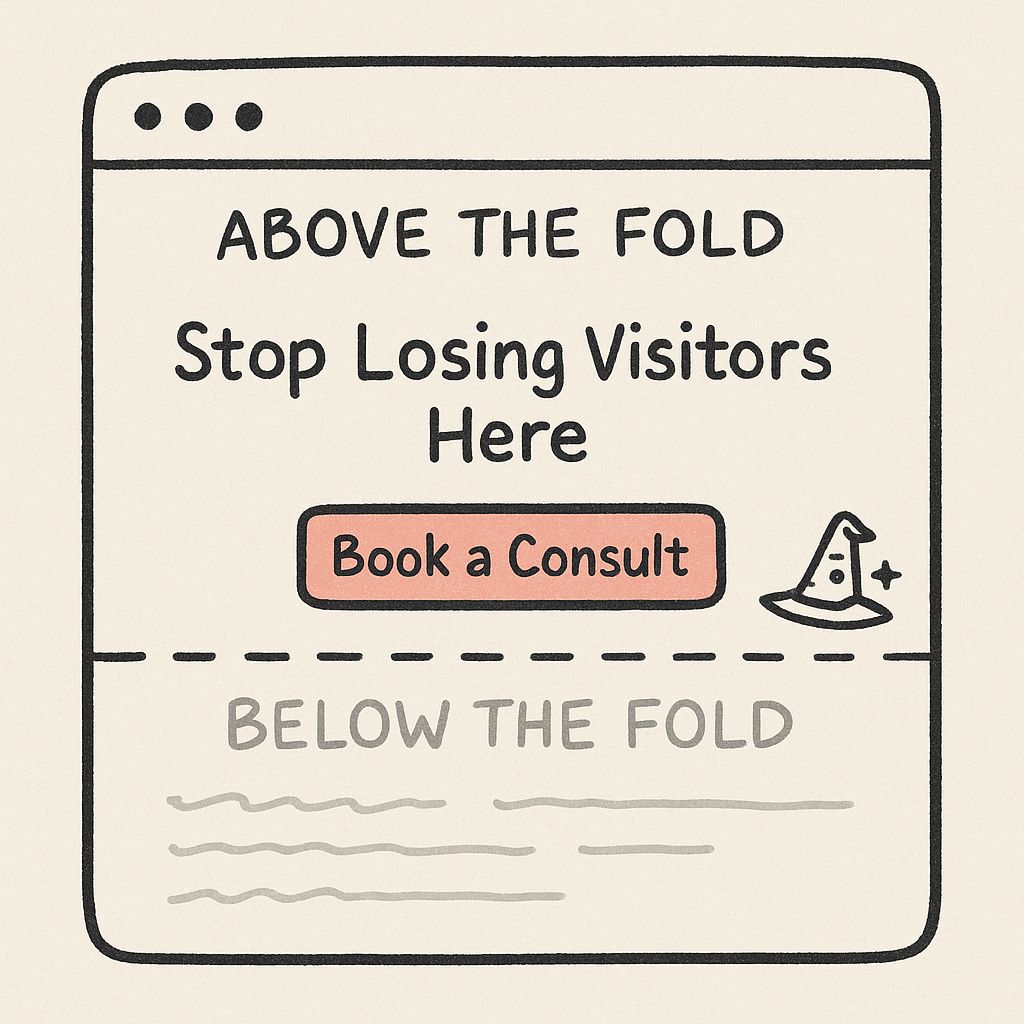
Here's a wake-up call: Your landing page is leaking money, and it's happening above the fold.
While you're obsessing over the perfect logo, colors, and what font to use, potential customers are bouncing faster than my dog when I try to bathe him. They're making split-second judgments about whether you're worth their time, and most of the time? You're failing the test.
Sure, you might be brilliant, but nobody's sticking around long enough to find out, so here is an easy checklist for you to follow that will boost your conversions.

Time Is Not Your Friend
Here's what's actually happening when someone lands on your site:
You have 50 milliseconds. That's 0.05 seconds for your website to make a first impression. To put that in perspective, it takes you longer to blink than it does for someone to judge your entire business.
Adding icing to the cake, 57% of your visitor's attention is spent above the fold. That's more than half of their brain power focused on what they can see without scrolling. This area is your prime real estate.
The problem isn't that you don't know marketing. The problem is you're playing a completely different game than your visitors. You're thinking about features and benefits while they're thinking about one thing: "What's in it for me, and can I trust this person not to waste my time?"
Meanwhile, your competition is flooding the market. AI is making it easier than ever to spin up new products, especially in the SaaS space. Differentiating yourself isn't just difficult, it's becoming nearly impossible if you can't nail those first 5 seconds.
Create a Conversion Machine: The See, Trust, Act Rule
Stop trying to be everything to everyone above the fold. Instead, use the "See, Trust, Act" framework to turn that tiny piece of real estate into a conversion machine.
See: The 3-Second Clarity Test
What visitors need to see instantly:
Crystal-clear headline that answers "What do you do?" (Studies show unclear headlines increase bounce rate by 85%)
Visual hierarchy that guides the eye naturally (F-pattern reading: left to right, top to bottom)
Benefit-focused subheading that answers "What's in it for me?"
The psychology: Your brain processes visual information 60,000 times faster than text. If your visual hierarchy is confusing, you've already lost.
Trust: The Credibility Stack
What builds instant trust:
Social proof positioned strategically (testimonials above the fold increase conversions by 34%)
Professional visuals that match your brand promise (consistent branding increases revenue by 23%)
Clear value proposition that doesn't require a PhD to understand
The psychology: The halo effect means if one element looks unprofessional, visitors assume everything else is too.
Act: The Friction-Free Flow
What drives action:
Single, prominent CTA (multiple CTAs can decrease conversions by up to 266%)
Urgency or scarcity that creates FOMO without being sleazy
Clear next step that feels like a natural progression
The psychology: Decision paralysis is real. Too many choices = no choice at all.
Quick Sip
Tickup Fold Fighting Audit
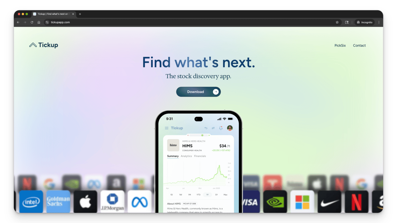
Let's put this framework to work. I'm going to dissect a real landing page using the 'See, Trust, Act' lens so you can see exactly how this plays out in the wild. Check out the screenshot below and think of three quick wins you would deploy yourself if this were your site!

Tickup found on Product Hunt
❗️ Copy Clarity: “Find what’s next” is catchy but abstract. Users still ask, “Next, what… and why should I care?” Clarity here drives first-second trust.
💡 Swap to a benefit + time frame: “Spot your next winning stock in under 60 seconds.” Follow with: “Swipe ideas, get AI-powered insights, act fast.”
❗️ Inject Credibility: Zero proof = risk. Early visitors don’t know who or what is behind the promise, so downloads stall.
💡 Insert a slim trust strip under the sub-headline: “Powered by IEX real-time data • Built by ex-analysts • FINRA/SEC compliant.” Even “1,200 beta users” or a testimonial beats silence.
❗️Make the CTA Unmissable: The lone “Download” button blends with the gradient and doesn’t say what they’re getting. Desktop users could miss it entirely.
💡 Create two CTAs: a high-contrast "Get the iOS app" button in the top-right nav (sticky on scroll) and a larger hero button labeled "Download Tickup free" with an iOS badge icon.
Was breaking down this example helpful? Leave a comment or reply. I’m happy to share more!
Your “See, Trust, Act” Scorecard
Time for some brutal self-assessment. Rate your current above-the-fold section using this scoring system:
SEE (Visual Clarity) - 30 points possible
Headline clarity: Can a 12-year-old understand what you do? (10 points)
Visual hierarchy: Does your eye naturally flow to the most important elements? (10 points)
Benefit focus: Is the value proposition obvious within 3 seconds? (10 points)
TRUST (Credibility Markers) - 35 points possible
Social proof: Do you have testimonials, reviews, or client logos visible? (15 points)
Professional design: Does everything look intentional and polished? (10 points)
Clear value: Can visitors immediately understand what outcome they'll get? (10 points)
ACT (Conversion Elements) - 35 points possible
Single CTA: Is there one clear, prominent call-to-action? (15 points)
Friction removal: Can someone take action without overthinking? (10 points)
Logical flow: Does the journey from headline to CTA make sense? (10 points)
Your Score:
80-100 points: You're a conversion ninja.
60-79 points: Close, but money is still leaking.
40-59 points: Emergency surgery needed.
Below 40 points: Burn it down and start over. Seriously.
The 5-Minute Fix Challenge
Pick your lowest-scoring area and spend exactly 5 minutes improving it right now:
SEE issues? Rewrite your headline using this template: "I help [target audience] achieve [specific outcome] without [major pain point]"
TRUST problems? Add one testimonial or client result above the fold
ACT confusion? Remove every CTA except your most important one
Ready to stop watching potential customers bounce off your site like they’re allergic to money?
Book your Clarity to Cash consultation, I’ll diagnose what’s killing your conversions and give you a prioritized fix-it list. If you don’t walk away with a clear action plan, you can get your money back.

Corking Things Up
Here are some ways I can help
Idea-to-Offer Clarity Kit — a tool to help you cut through the chaos, pick one aligned idea, and start building with confidence.
Async Potion Review — a quick product teardown that includes a 15m Loom walkthrough and a one-page action plan, delivered within 48hr.
If I can’t surface three actionable quick wins, you’ll be credited toward a live strategy call.
Don’t miss me too much, I’ll see ya next week! 👋
— Dana
P.S. If you enjoy my emails, move them to your primary inbox and let me know by sending a reply or clicking the poll below. I love feedback!


