Hey, {{first_name | product-preneur}}!
Onboarding shouldn't feel like a job application.
But I just watched someone go through 6 screens before they could even see the product they signed up for. Six. Screens.
Name, email, password, business goals, team size, another goal selection, and finally... maybe they get to use the thing.
By screen three, I wanted to quit. And I'm not even a real user, I'm just some bald guy tearing apart onboarding flows on a Tuesday afternoon.

Potion of the Week
The Brain Quits Before You Do
Here's what's happening in your user's head during a long onboarding flow:
Screen 1: "Okay, I'm curious."
Screen 2: "Sure, makes sense."
Screen 3: "Wait, how much longer is this?"
Screen 4: "Do I even need this product?"
Screen 5: closes tab forever
Your brain can only juggle about 7 things before it starts rage-quitting. Every extra screen, every form field, every dropdown is cognitive load piling up like laundry you keep ignoring.
And statistically? If someone doesn't convert in the first seven days, they're never coming back.
So why are we putting a obstacle course between people and their money?
Magic Sauce
I pulled a random onboarding flow from Mobbin (no sponsorship, just my favorite internet rabbit hole) and did what I do best: removed the bullshit. 😉
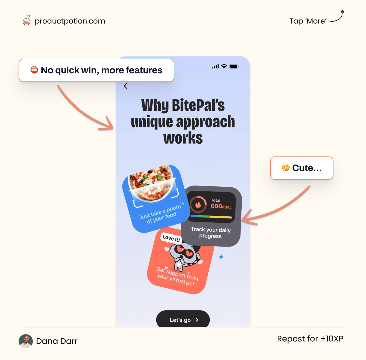
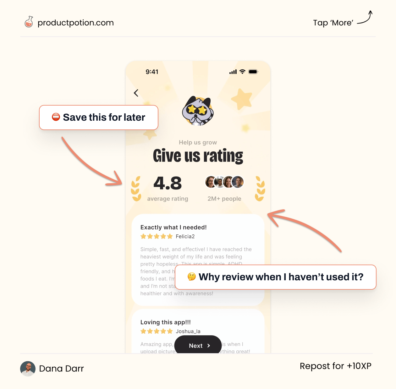
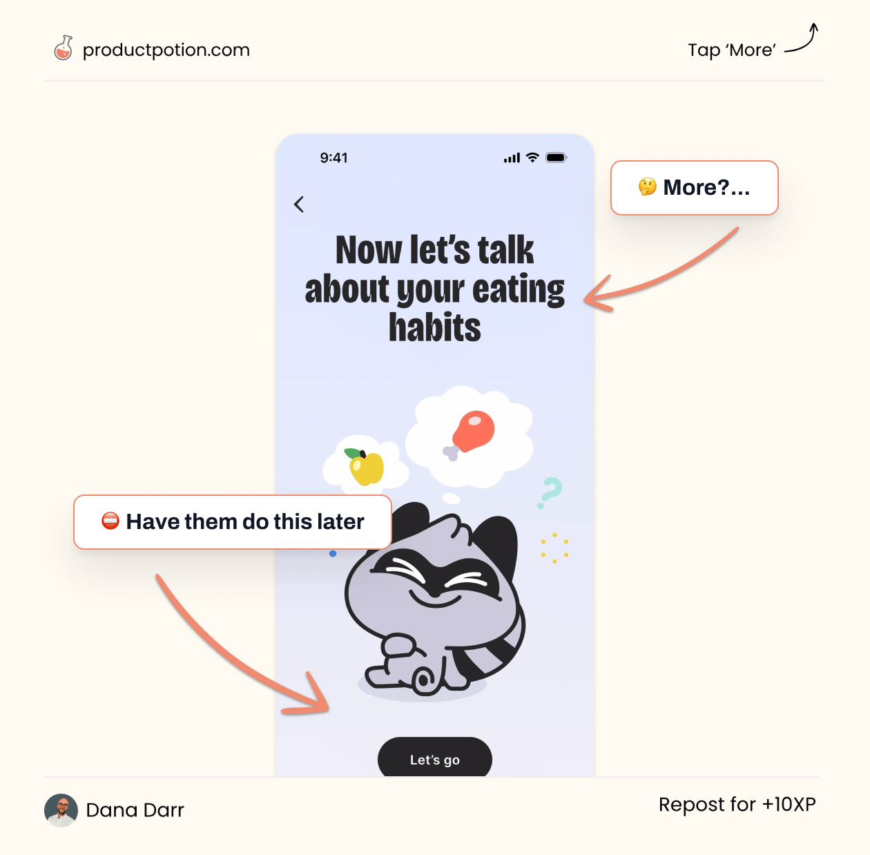
The product? Bite Me. A perfectly good tool that makes you work way too hard to see why you should care.
I'm going to show you what needs to go, what needs to stay, and how to get users to their first quick win in half the time.
Not wizardry. Just the specific friction points killing conversion rates right now.

1/10

2/10

3/10

4/10

5/10

6/10

7/10

8/10

9/10

10/10

What to Remove to Make Money Easier
If you’re working with flows longer than a Harry Potter novel, here's what I’d cut:
The "Tell us about yourself" circus - Three separate screens asking about business type, team size, and goals. Condensed into one optional step after they've seen value.
The tutorial nobody asked for - Moved education to contextual tooltips instead of forcing it upfront.
Every "required" field that wasn't actually required - Email and password? Fine. Everything else? Collect it later when they actually care.
The goal: Get them clicking around the actual product in under 30 seconds instead of filling out forms like they're applying for a mortgage.

Corking Things Up
Your Turn
Check out the visual breakdown above and hit reply if you:
See more opportunities I missed
Think I'm wrong and want to fight about it
Want me to tear apart your onboarding flow next
Seriously, send me your flow. I'll roast it with love.
Brew Clarity, Ship Ugly, Create Revenue
If your product has traffic but conversion feels off, reply "CLARITY" and let's talk about removing the unnecessary complexity from your first experience.
Fewer steps. Clearer decisions. Faster wins. 👋

👋 I’ll see ya next week! — Dana
P.S. If you enjoy my emails, move them to your primary inbox and let me know by sending a reply or clicking the poll below.
I respond to every reply. Let’s make this community about YOU!


